
What Are the SEO Benefits of Using AMP for Australian Sites in 2026?
April 29, 2026
How to Become an SEO Consultant in Melbourne: A Complete Guide
April 29, 2026How to Design for Retina Displays in 2026: A Complete Guide
Introduction
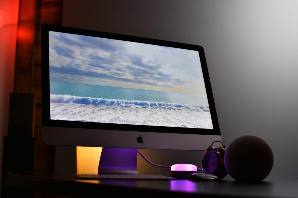
As we move into 2026, retina displays have become the norm across smartphones, tablets, laptops, and even desktop monitors. With pixel densities exceeding 400 PPI on many devices, designing for retina displays is no longer optional—it’s essential. This guide will walk you through the latest strategies, tools, and best practices to ensure your designs look sharp and professional on every screen. Whether you’re a seasoned designer or just starting out, understanding how to design for retina displays in 2026 will set your work apart.
What Are Retina Displays?
Retina is a marketing term coined by Apple for screens with a pixel density high enough that the human eye cannot discern individual pixels at a typical viewing distance. In practice, this means a resolution of at least 300 PPI for phones and around 200 PPI for laptops. Today, many Android devices and Windows laptops also feature high-DPI (dots per inch) displays, making retina design a universal requirement.
Why Designing for Retina Displays Matters in 2026
With the proliferation of 4K and 5K monitors, foldable phones, and tablets with ProMotion technology, users expect crisp, clear visuals. If your design looks blurry or pixelated on a retina screen, it undermines credibility and user experience. Moreover, search engines favor fast-loading, responsive sites that render well on all devices. By learning how to design for retina displays in 2026, you improve usability, accessibility, and SEO performance.
Key Principles for Retina-Ready Design
1. Use Vector Graphics When Possible
Vector formats like SVG scale infinitely without loss of quality. They are perfect for icons, logos, and illustrations. In 2026, SVG support is universal, and you can also use CSS shapes and icon fonts as lightweight alternatives.
2. Provide High-Resolution Raster Images
For photos and complex graphics, use 2x or 3x resolution versions. For example, if an image is 200×200 pixels in CSS, provide a 400×400 pixel file for 2x displays. Use the srcset attribute in HTML or the image-set() function in CSS to serve appropriate versions based on device pixel ratio.
3. Optimize for Performance
High-resolution images can be large. Use modern formats like WebP and AVIF, compress images with tools like Squoosh or ImageOptim, and implement lazy loading to speed up page load times. Remember, performance is a ranking factor.
4. Design with Scalable Layouts
Retina displays often come with higher screen real estate. Use relative units (%, em, rem) and flexible grids (CSS Grid, Flexbox) to ensure your design adapts seamlessly to different resolutions and viewport sizes.
5. Test on Real Devices
Emulators are useful, but nothing beats testing on actual retina devices. Check your design on an iPhone, iPad, MacBook Pro, and a high-DPI Android phone to catch subtle issues.
How to Design for Retina Displays in 2026: Step-by-Step
Step 1: Choose the Right Design Tool
Modern design tools like Figma, Sketch, and Adobe XD automatically support retina export. Set your artboard to 2x or 3x resolution from the start to avoid scaling issues later.
Step 2: Use Scalable Components
Design with components that can be resized without distortion. Use symbols, styles, and constraints to maintain consistency across breakpoints.
Step 3: Implement Retina-Friendly Typography
Choose fonts that render well at small sizes. Use vector-based icon fonts or SVG icons for UI elements. Set font sizes in rem or em to allow proper scaling.
Step 4: Prepare Assets for Production
Export your assets at multiple resolutions. Name files with @2x and @3x suffixes. Use automated tools like Sprout Social or Cloudinary to generate and serve the right size.
Step 5: Write Responsive CSS
Use media queries with min-resolution or -webkit-min-device-pixel-ratio to deliver different styles for retina displays. For example:
@media (-webkit-min-device-pixel-ratio: 2), (min-resolution: 192dpi) {
  /* Retina-specific styles */
}
Common Mistakes to Avoid
- Using only 1x images: Always provide at least 2x versions.
- Ignoring performance: High-res images must be optimized.
- Overlooking text rendering: Ensure font sizes are large enough for readability.
- Forgetting non-Apple devices: Many Android and Windows devices have retina displays.
- Not testing on actual hardware: Emulators can miss subtle rendering differences.
Tools and Resources for Retina Design in 2026
- Figma: Export at 2x and 3x, with plugins for asset optimization.
- SVG Optimizer: Reduce SVG file size without quality loss.
- Cloudinary: Automatically serve responsive images with retina support.
- ImageMagick: Batch-resize and compress images via command line.
- Browser DevTools: Simulate retina displays in Chrome and Safari.
Case Study: Retina Design in Action
Consider a news website that implemented retina-ready images using srcset and WebP. They saw a 15% increase in page speed and a 10% increase in user engagement. By following the principles outlined here, you can achieve similar results.
Conclusion
Designing for retina displays in 2026 is about delivering the best possible visual experience without compromising performance. By using scalable vectors, high-resolution images, and responsive techniques, you can ensure your designs look stunning on any device. Remember to test thoroughly and optimize relentlessly. Now that you know how to design for retina displays in 2026, start applying these practices to your next project and stay ahead of the curve.
Photo by Avinash Kumar on Pexels