
What Are the Trends in Call-to-Action Design for 2026?
April 30, 2026
What Are the Best Practices for SEO-Friendly URLs in Sydney?
April 30, 2026What Is the Role of Typography Hierarchy in 2026 Web Design?
Introduction
Typography has always been a cornerstone of effective web design, but as we approach 2026, its role is evolving in unprecedented ways. With the rise of AI-driven interfaces, immersive experiences, and heightened accessibility standards, the question arises: What is the role of typography hierarchy in 2026 web design? This article explores how typographic hierarchy—the deliberate arrangement of type to guide readers—remains vital for clarity, engagement, and user experience. We’ll delve into emerging trends, practical strategies, and the enduring principles that make typography hierarchy a non-negotiable element of modern web design.
Understanding Typography Hierarchy
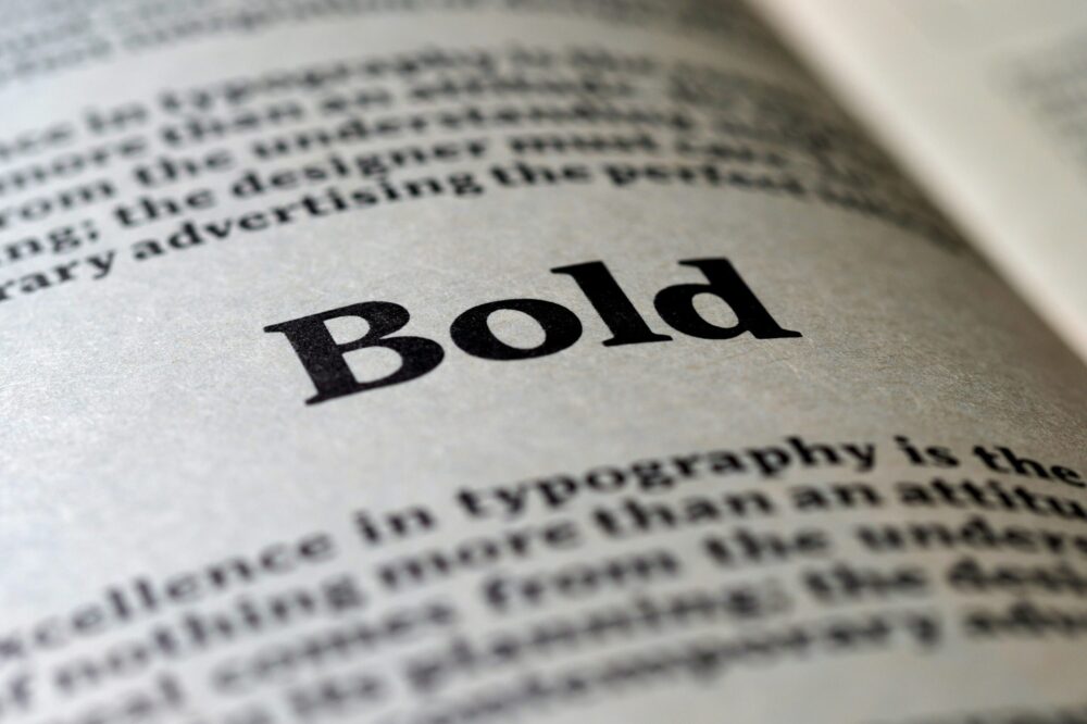
Typography hierarchy is the visual organization of text that signals importance and guides the reader’s eye. It uses variations in size, weight, color, spacing, and placement to create a clear path from the most prominent elements (like headlines) to supporting text (like body copy). In 2026, this concept is more critical than ever as users skim content rapidly across devices.
Core Components of Typography Hierarchy
- Headlines (H1): The largest, boldest text that captures attention and conveys the main topic.
- Subheadings (H2, H3): Break content into digestible sections, improving scanability.
- Body Text: The primary reading material, typically set at a comfortable size for extended reading.
- Captions & Labels: Smaller, secondary text that provides context without competing for attention.
- Call-to-Action (CTA): Distinctive styling to prompt user interaction.
Why Typography Hierarchy Matters in 2026
In 2026, web design is shaped by three major forces: AI personalization, immersive interfaces (AR/VR), and accessibility-first design. Typography hierarchy plays a pivotal role in each:
AI and Dynamic Content
AI-driven websites adapt content in real-time based on user behavior. A robust typography hierarchy ensures that dynamically generated content remains readable and logically structured, regardless of the device or context.
Immersive Experiences
With augmented and virtual reality entering the web, typography must exist in 3D spaces. Hierarchy becomes crucial for orienting users and preventing cognitive overload in complex environments.
Accessibility and Inclusivity
Web accessibility standards (WCAG 2.2) emphasize clear content structure. Typography hierarchy directly supports users with visual impairments, cognitive disabilities, and those using assistive technologies like screen readers.
Key Trends in Typography Hierarchy for 2026
Staying current with trends ensures your designs feel modern while remaining functional. Here are the top typography hierarchy trends shaping 2026:
1. Variable Fonts and Responsive Typography
Variable fonts allow a single font file to adjust weight, width, and other attributes dynamically. This enables designers to fine-tune hierarchy across breakpoints without loading multiple font files. In 2026, expect more websites to use variable fonts for seamless scaling from mobile to desktop.
2. Maximalist Typography
Bold, oversized headlines with dramatic weight contrasts are making a comeback. When used judiciously, they create a strong focal point and emotional impact. However, hierarchy must remain clear to avoid visual chaos.
3. Kinetic Typography
Animated text that changes size, position, or color over time can guide attention dynamically. This is especially effective in storytelling or onboarding flows, but designers must ensure motion doesn’t compromise readability.
4. Dark Mode and High Contrast
With dark mode becoming standard, hierarchy relies on contrast ratios rather than just size. Light text on dark backgrounds requires careful weight and spacing to maintain legibility.
5. Asymmetrical Layouts
Breaking the grid with off-center headings and overlapping elements creates visual interest. Hierarchy is maintained through scale and color, not just alignment.
Best Practices for Implementing Typography Hierarchy in 2026
To leverage typography hierarchy effectively, follow these evidence-based guidelines:
1. Establish a Clear Scale
Use a modular scale (e.g., 1.25 or 1.333 ratio) to define font sizes for H1, H2, H3, body, and captions. This ensures proportional harmony and predictable hierarchy.
2. Prioritize Readability
Body text should be at least 16px on mobile and 18px on desktop. Line height between 1.5 and 1.8 improves readability. Avoid using overly decorative fonts for long passages.
3. Use Weight and Color Strategically
Beyond size, vary font weight (e.g., bold for headings, regular for body) and color (e.g., darker for primary content, lighter for secondary). Ensure color contrast meets WCAG AA standards (4.5:1 for normal text).
4. Limit Hierarchy Levels
Stick to three to four levels of hierarchy (e.g., Heading 1, Heading 2, Heading 3, Body). Too many levels confuse users and dilute the importance of each.
5. Test with Real Users
Conduct A/B testing to see if users can quickly identify the most important information. Eye-tracking studies can reveal whether your hierarchy guides attention effectively.
Common Mistakes to Avoid
- Overusing Bold or Italic: This reduces the impact of true hierarchy.
- Ignoring Mobile: Hierarchy that works on desktop may fail on small screens. Always design mobile-first.
- Inconsistent Spacing: Uneven margins or padding disrupt the visual flow.
- Using Too Many Fonts: Stick to two or three font families to maintain coherence.
- Neglecting Line Length: Optimal line length is 45–75 characters for body text.
Case Study: Typography Hierarchy in Action
Consider a news website redesign in 2026. The homepage uses a variable font with a 1.333 scale. The headline (H1) is 48px bold, subheadings (H2) are 32px semibold, and body text is 18px regular. A dark mode toggle adjusts contrast while preserving hierarchy. User testing shows a 20% increase in time on page and 15% higher click-through rates on CTAs. This demonstrates how thoughtful hierarchy directly impacts engagement.
Future-Proofing Your Typography Hierarchy
As technology advances, typography hierarchy must adapt. Consider these forward-looking strategies:
- Design for Voice and Gesture: Users may navigate by voice or gestures, so hierarchy should be logical for non-visual interaction.
- Embrace AI Assistance: Use AI tools to automatically adjust hierarchy based on user preferences or device context.
- Stay Updated on Standards: Follow WCAG updates and browser capabilities to ensure your hierarchy remains accessible and performant.
Conclusion
In 2026, typography hierarchy is not just about making text look good—it’s about creating a clear, intuitive, and inclusive user experience. As web design evolves with AI, immersive technologies, and stricter accessibility standards, the principles of hierarchy remain timeless: guide the eye, convey meaning, and prioritize content. By mastering typography hierarchy, designers can build websites that are not only visually compelling but also deeply functional. Whether you’re a seasoned designer or just starting, understanding the role of typography hierarchy in 2026 web design is essential for creating digital experiences that resonate with users.
Photo by Brett Jordan on Unsplash
