
How to Create a Cohesive Brand Identity Through Web Design in 2026
April 30, 2026
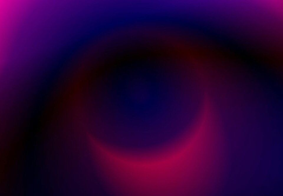
How to Use Gradients in Typography for 2026: A Complete Guide
April 30, 2026Introduction
Typography is a cornerstone of web design, and in 2026, designers are pushing boundaries with vibrant gradient text. Gradients in typography add depth, emotion, and visual interest, making headlines pop and brand messaging more memorable. Whether you’re a seasoned designer or a beginner, mastering how to use gradients in typography for 2026 can set your work apart. In this guide, we’ll explore the latest trends, techniques, and tools to help you create stunning gradient typography that captivates audiences.
Why Gradients in Typography Matter in 2026
Gradients have evolved from simple linear blends to complex, animated, and multi-color transitions. In 2026, they are a key element in modern design, offering several benefits:
- Enhanced Visual Appeal: Gradients catch the eye and make text stand out, especially on busy backgrounds.
- Brand Expression: Custom gradients can convey brand personality and emotion, from energetic to sophisticated.
- Improved Readability: When used correctly, gradients can improve contrast and legibility, especially for large headings.
- Trend Alignment: Gradients align with the 2026 design trends of bold, immersive, and dynamic visuals.
Understanding Gradient Types for Typography
Before diving into implementation, it’s essential to understand the types of gradients you can apply to text. The most common include:
Linear Gradients
Linear gradients transition colors along a straight line. They are versatile and work well for headings where a smooth, directional color shift is desired.
Radial Gradients
Radial gradients radiate from a central point, creating a circular or elliptical blend. They add a spotlight effect, drawing attention to specific words.
Conic Gradients
Conic gradients rotate around a center point, producing a color wheel effect. They are trendy for futuristic or playful designs.
Animated Gradients
Animated gradients move or shift over time, adding a layer of interactivity. In 2026, subtle animations are popular for hero sections and call-to-action buttons.
How to Use Gradients in Typography for 2026: Step-by-Step
Now let’s get practical. Follow these steps to implement gradient text effectively:
1. Choose the Right Font
Not all fonts work well with gradients. Choose bold, thick fonts like sans-serif or slab serif for maximum impact. Thin or script fonts may lose legibility. Popular choices include Inter, Montserrat, Playfair Display, and Roboto.
2. Select a Color Palette
Your gradient colors should align with your brand and the message. Use tools like Adobe Color or Coolors to create harmonious palettes. For 2026, consider these trends:
- Neon Gradients: Bright pinks, cyans, and yellows for a futuristic vibe.
- Earthy Gradients: Warm browns, greens, and terracottas for a natural feel.
- Pastel Gradients: Soft lavenders, mint greens, and peaches for a gentle aesthetic.
- Monochromatic Gradients: Shades of a single color for elegance and simplicity.
3. Apply the Gradient Using CSS
For web typography, CSS is the standard. Use the background-clip and text-fill-color properties:
h1 {
  background: linear-gradient(90deg, #ff7e5f, #feb47b);
  -webkit-background-clip: text;
  -webkit-text-fill-color: transparent;
  background-clip: text;
}
This creates a linear gradient from coral to peach. Adjust the angle, colors, and stops as needed.
4. Optimize for Readability
Gradient text can be hard to read if not executed properly. Follow these tips:
- Use high contrast: Ensure the gradient colors contrast well with the background.
- Add a text shadow or outline: For extra legibility, apply a slight dark or light shadow.
- Keep it simple: Avoid too many color stops; 2-3 colors are usually sufficient.
- Test on different devices: Check how the gradient appears on mobile and desktop.
5. Add Animation (Optional)
Animated gradients are a 2026 trend. Use CSS keyframes to move the gradient:
@keyframes gradientShift {
  0% { background-position: 0% 50%; }
  50% { background-position: 100% 50%; }
  100% { background-position: 0% 50%; }
}
h1 {
  background: linear-gradient(270deg, #ff7e5f, #feb47b, #86a8e7, #91eae4);
  background-size: 400% 400%;
  -webkit-background-clip: text;
  -webkit-text-fill-color: transparent;
  animation: gradientShift 5s ease infinite;
}
This creates a moving gradient that shifts horizontally.
Tools for Creating Gradient Typography
Several tools can help you design and implement gradients without coding from scratch:
- CSS Gradient Generator: Websites like cssgradient.io allow you to create and export CSS code.
- Figma: Design gradients visually and then copy the CSS.
- Adobe Photoshop/Illustrator: For static designs, these tools offer advanced gradient controls.
- Gradient Hunt: A curated gallery of beautiful gradients for inspiration.
- Webflow: A no-code platform that supports gradient text with visual editors.
Best Practices for Gradients in Typography (2026 Edition)
To ensure your gradient typography is both beautiful and functional, follow these best practices:
Use Gradients Sparingly
Apply gradient text to headings, logos, or key phrases, not entire paragraphs. Overuse can overwhelm readers and reduce readability.
Consider Accessibility
Ensure sufficient color contrast. Use tools like WebAIM’s Contrast Checker to verify that your gradient meets WCAG standards, especially for body text.
Match the Mood
Gradients evoke emotions. Bright, saturated gradients feel energetic; muted, dark gradients feel sophisticated. Choose accordingly.
Stay On-Brand
Use brand colors in your gradient to reinforce identity. If your brand uses a specific color palette, incorporate it into the gradient.
Test Across Browsers
CSS gradients are widely supported, but older browsers may not render them. Provide fallback colors for unsupported browsers.
Common Mistakes to Avoid
Even experienced designers can make mistakes with gradient typography. Here are pitfalls to avoid:
- Too Many Colors: Using more than 3-4 colors can make text look messy.
- Poor Contrast: Light gradients on light backgrounds or dark on dark reduce readability.
- Ignoring Background: The gradient text must stand out against its background.
- Overusing Animation: Constant animation can distract and annoy users. Use subtle, slow movements.
- Neglecting Mobile: Gradients may look different on mobile screens; test thoroughly.
Examples of Gradient Typography in 2026
To inspire you, here are some real-world applications of gradient text:
Hero Headlines
Landing pages often feature large, gradient headlines that immediately grab attention. For example, a tech startup might use a neon blue-to-purple gradient on a dark background.
Logo Typography
Brands are using gradients in their logos to appear modern. A gradient from deep blue to teal can convey trust and innovation.
Call-to-Action Buttons
Gradient text on buttons (or buttons with gradient backgrounds) can increase click-through rates. An orange-to-red gradient on a white button stands out.
Social Media Graphics
Influencers and brands use gradient text in Instagram stories and posts to create visually appealing content.
Future Trends: Gradients in Typography Beyond 2026
As technology evolves, so will gradient typography. Expect to see:
- AI-Generated Gradients: AI tools that create unique gradients based on brand guidelines.
- 3D Gradients: Text with depth and lighting effects that simulate 3D.
- Interactive Gradients: Gradients that change based on user interaction, such as mouse movement.
- Variable Fonts with Gradients: Fonts that dynamically adjust weight and gradient simultaneously.
Conclusion
Gradients in typography are a powerful tool for creating visually striking and engaging designs. By understanding how to use gradients in typography for 2026, you can elevate your web projects, enhance brand identity, and captivate your audience. Remember to choose the right font, select harmonious colors, apply CSS correctly, and prioritize readability. With the techniques and best practices outlined in this guide, you’re ready to create gradient text that stands out. Start experimenting today and watch your typography come to life with vibrant, dynamic gradients.