How to Implement Micro-Interactions in Web Design 2026: A Complete Guide
April 27, 2026
What Is the Role of Data Visualization in Web Design 2026?
April 27, 2026What Are the Trends in Dark Mode Web Design? A Comprehensive 2025 Guide
Introduction
Dark mode has evolved from a niche preference into a mainstream user interface standard. As we move through 2025, the question “What are the trends in dark mode web design?” is more relevant than ever. Users now expect dark mode options across websites and applications, not only for aesthetic reasons but also for reduced eye strain and improved battery life on OLED screens. This article explores the latest trends, best practices, and future directions of dark mode web design, offering actionable insights for designers and developers.
Why Dark Mode Matters in 2025
Dark mode is no longer an afterthought; it’s a critical feature for user satisfaction. Studies show that over 80% of users prefer dark mode when available, citing reduced glare and longer screen time comfort. Furthermore, dark mode can significantly improve accessibility for users with visual sensitivities. In 2025, the trend is toward seamless, system-aware dark mode that automatically adapts to user preferences, enhancing the overall user experience.
Trend #1: Dynamic Dark Mode with System Preferences
One of the strongest trends in dark mode web design is the integration with operating system settings. Modern websites detect the user’s system-wide dark mode preference using the prefers-color-scheme media query and switch automatically. This eliminates the need for manual toggling and provides a consistent experience across devices.
Implementing Automatic Switching
To implement this, designers use CSS custom properties and JavaScript to respond to changes in system preferences. The trend is moving toward true dynamic switching without page reload, using CSS transitions for smooth color changes. This approach respects user choice while maintaining performance.
User Control Override
While automatic switching is preferred, giving users manual control remains important. A toggle button in the header or settings panel allows users to override system preferences. The trend is to place this toggle prominently, often with a sun/moon icon, and to remember the choice via local storage.
Trend #2: True Black vs. Dark Gray Backgrounds
There is an ongoing debate about whether to use pure black (#000000) or dark gray (e.g., #121212) for backgrounds. In 2025, the trend leans toward dark gray for most content-heavy sites. Pure black can cause eye strain due to high contrast, while dark gray reduces glare and creates a softer reading experience. However, for OLED screens, true black saves battery by turning off pixels, so some apps (like YouTube) offer an “AMOLED dark” option. The key is to test both and choose based on your audience and content type.
Trend #3: Accent Colors That Pop
Dark mode provides a canvas for vibrant accent colors. The trend is to use neon or saturated hues for interactive elements like buttons, links, and highlights. Colors like electric blue, lime green, and coral create striking contrast against dark backgrounds without being harsh. Designers are also experimenting with gradient accents and duotone effects to add depth.
Accessibility Considerations
Accent colors must meet WCAG contrast ratios against dark backgrounds. Tools like WebAIM’s contrast checker help ensure readability. The trend is to use a limited palette of two to three accent colors to maintain consistency and avoid visual clutter.
Trend #4: Reduced Shadows and Depth
In light mode, shadows indicate elevation. In dark mode, shadows become less visible. The trend is to use subtle light-colored shadows or completely remove them, relying instead on layering and color differences to create depth. Some designers use a slight glow effect behind elevated elements, mimicking the way light would reflect in a dark environment.
Trend #5: Images and Media Optimization
Images designed for light mode can appear harsh in dark mode. The trend is to use dark mode–friendly media with reduced brightness and contrast. For photographs, applying a dark overlay or using CSS filters can help. Another approach is to serve different image assets via the picture element based on the color scheme. Illustrations and icons should be designed in vector formats with transparent backgrounds and appropriate colors for dark backgrounds.
Trend #6: Customizable Dark Mode Themes
Personalization is a major trend. Allowing users to choose between multiple dark mode variants—such as “Dark,” “Darker,” and “AMOLED Black”—gives them control over their experience. Some sites also offer accent color pickers within dark mode. This trend is particularly popular in productivity tools and social media platforms.
Trend #7: Glassmorphism and Neumorphism in Dark Mode
Glassmorphism (frosted glass effect) and neumorphism (soft UI) are making their way into dark mode designs. The transparent, blurry backgrounds of glassmorphism look elegant on dark surfaces, while neumorphism’s subtle shadows and highlights create a tactile feel. These trends must be applied carefully to maintain readability and accessibility.
Trend #8: Micro-Interactions and Animations
Dark mode benefits from subtle animations that respond to user actions. Hover effects, loading indicators, and transitions can be designed with dark mode in mind. The trend is to use luminous or glowing animations that feel natural in a dark environment. For example, a button might emit a soft glow when hovered, or a spinner could use a neon color.
Trend #9: Typography and Readability
Typography choices must adapt to dark mode. The trend is to use lighter font weights (e.g., 300–400) to avoid the “blooming” effect where heavy fonts appear too bold on dark backgrounds. Line height should be increased slightly, and letter spacing may need adjustment. Sans-serif fonts remain popular for their clarity, but serif fonts can work with careful sizing.
Font Color Contrast
Body text should not be pure white (#FFFFFF) but a softer off-white (#E0E0E0) to reduce eye strain. Headings can be brighter (#FFFFFF) for emphasis. The trend is to use a color palette that maintains a contrast ratio of at least 7:1 for body text and 4.5:1 for larger text.
Trend #10: Dark Mode for Email and Forms
Dark mode is extending beyond websites to email clients and form UI. Email designers are creating dark mode–compatible templates using inline CSS and MSO conditional comments. Forms in dark mode should have clearly defined input fields with light borders or subtle background colors. The trend is to ensure all interactive elements remain visible and functional in both modes.
Best Practices for Implementing Dark Mode
- Use CSS custom properties: Define color variables for light and dark themes to simplify maintenance.
- Test on real devices: Check how colors appear on different screens, especially OLED and LCD.
- Provide a smooth transition: Use CSS transitions to animate color changes, avoiding abrupt flashes.
- Optimize images: Apply CSS filters or serve alternate images for dark mode.
- Respect user preferences: Use
prefers-color-schemeand allow manual override. - Maintain accessibility: Ensure contrast ratios meet WCAG standards and support reduced motion settings.
Common Mistakes to Avoid
- Using pure black and white: High contrast causes eye strain; use dark gray and off-white instead.
- Inverting colors blindly: Some colors become unreadable when inverted; choose colors specifically for dark mode.
- Ignoring images: Bright images can ruin the dark mode experience; adjust them accordingly.
- Forgetting about shadows: Remove or adjust shadows that rely on light backgrounds.
- Not testing all components: Ensure modals, tooltips, and dropdowns also have dark mode styles.
The Future of Dark Mode Web Design
Looking ahead, dark mode will become even more adaptive. We can expect AI-driven dark mode that adjusts contrast and colors based on ambient light, time of day, and user activity. Integration with augmented reality and virtual reality interfaces will also emerge. The line between light and dark mode may blur as websites offer “adaptive themes” that shift gradually. For now, the trends in dark mode web design focus on user control, accessibility, and aesthetic sophistication.
Conclusion
So, what are the trends in dark mode web design in 2025? They revolve around dynamic system integration, thoughtful color choices, accessible typography, and personalized user experiences. Dark mode is no longer just a feature—it’s an essential part of modern web design that enhances usability and user satisfaction. By following the trends and best practices outlined in this article, you can create dark mode experiences that are both beautiful and functional. Start implementing these trends today to stay ahead in the ever-evolving landscape of web design.
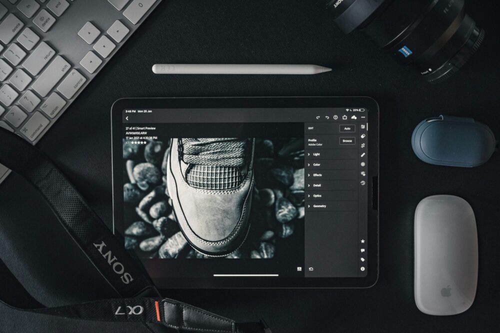
Photo by Albert Vincent Wu on Unsplash
